Friday, 28 November 2014

Editing the title (Sarah and Beth)

Editing the title
We spent a few hours in the editing suite with the aim of finishing our title sequence.

We wanted to use the same font in our title sequence as we would on the film poster, which meant it had to be downloaded.


Problems in editing
  • Placing the font into final cut pro became an issue for us as we were unable to use the font we had hoped for because it was not on the system. With the help of the media technician, we were able to download the font from 'dafont.com'. We then used the text on final cut pro to put this into our film.   
  • We then added a fade into white on the orginal footage and a dissolve on the text so that they appeared to merge at the same time.
  • When it came to adding our names and our actresses names into the sequence, we decided that a simpler font to the title would work best. We again added fades to each name and had them in white. They are clearly visible against the slightly off white background but add to the brightness of the shot.
Overall outcome:


Ceiling Light Change

One of the shots in our film is a tracking shot of the ceiling of the hospital. The lights can be seen moving past the camera, giving the impression that the victim is moving on a bed through the building. We filmed this at the location by placing the camera on the mobile hospital bed we were given to use and wheeling it through the corridor. However, we encountered a few problems. The corridor wasn't quite long enough for the duration of the shot we wanted, and also although we wanted the shot to be brightly lit, in this case it was too light which meant it caused an inavoidable glare on the camera.

We had to come up with a different idea, and decided that we could have the same desired effect if we did the same thing in college. We borrowed a trolley from the college and wheeled it through the corridor and found that it worked a lot better than at the hospital.

I then took to the editing suite and chanaged some aspects of the shot.


With the orginal footage, the green wall and display boards can be seen on the side of the frame. I zoomed in on the shot and titled it slightly so that it was more central and straight.


I then used the colour correction tool to change the mids, whites and blacks of the shot to make it both the lights and the areas around them brighter. 


This was the outcome. The lights appear much bigger and take up much more of the shot, the end result that we were hoping for.

Wednesday, 26 November 2014

Tuesday, 25 November 2014

Film Analysis - 2AM short film (Sarah)


2AM - short film analysis

Film Poster Analysis- 'Don't Look Now' (Becky)

Film Poster Analysis - 'My Name Is Joe'(Becky)

As usual, independent film makers release multiple versions of posters for their films in order to ranch out to a variety of target audiences to attract them to their low budgeted films.
In this case i have found 6 movie posters for the British independent film 'My Name Is Joe'(1999).
A few of these posters were obviously targeted at non English speaking countries all together as the text is in different languages from around the world.
The poster I chose was released in both Us and the UK to grasp the most English speaking countries in the world and pull them into the cinema to whiteness a British independent masterpiece.

How the makeup for hospital scene turned out -(Sarah)

How the makeup for hospital scene turned out:

After doing my research into applying fake blood, I carefully put the fake blood oto our actress' (Liz) face and under a bandage of her head. I aimed to put this on as realistic as possible. Here was the result:
We also used the fake blood for the tube connected to the characters hand. although it would not pour through the tube, we had the idea of sucking up through the tube so the blood came up. Although it had a few gaps in, I think this worked very well and was definitely a good decision. 

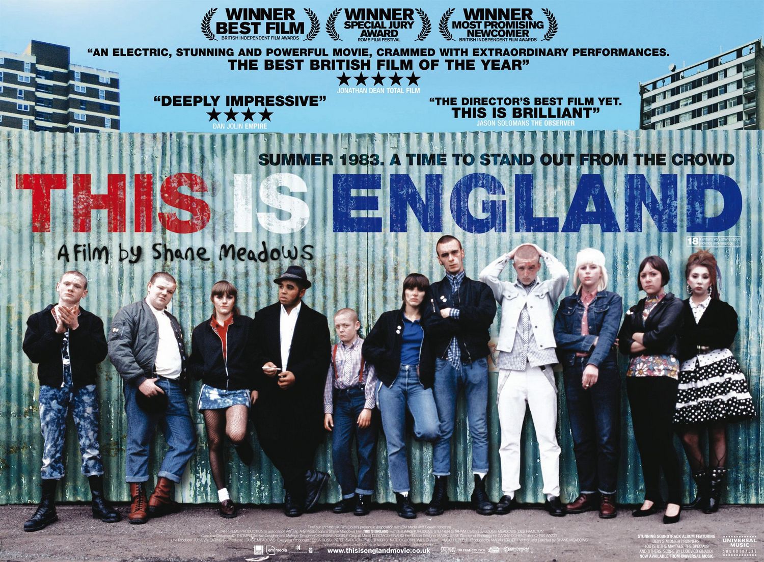
Film poster analysis - This Is England (Sarah)

http://www.impawards.com/2007/posters/this_is_england_xlg.jpg
This Is England
Film Analysis

MRANG -
Media language - 
Editing - layout
Mise En scene - Costume
Representation -
  1. Ethnicity - Each character is presented looking straight in the eye of the camera with a stern facial expression. This however does not apply to the one black character shown, this is a representation of racism in the 1980's and is what the film is based around. The character doesn't feel confident enough to look straight at the camera and portrays he feels he must try and stay out of trouble as someone white might think he's trying to start a fight.
  2. Class - Setting - Tall flat buildings (which look like council flats) and corrugated tin fence have connotations of working class.
  3. Class - Costume - Each character is dressed in appropriate clothing to the era of time. For example the male characters are wearing leather boots and rolled up jeans with a 'skinhead' type of haircut which was popular in the 80's. The majority of the girls have fringes and are wearing denim and appear quite punk. 
Audience -
Age Certificate - This film is certified by the British Board of Film Classification as an 18. This is due to the violence towards the end of the film and also deals with the issue of racism which people younger than 18 may not have a full understanding of the situation in England in the 80's as well. Because of the time and era the film is set in, it may appeal to an older audience because
they will remember the 1980s and have feelings of nostalgia, whereas a younger audience would not.
Narrative -
The film poster does not give too much away about the narrative other than the clear era and location of the film. The audience can tell this from the mise en scene but also by the tagline "Summer 1983. A time to stand out from the crowd" which also helps set the scene and gives connotations of the narrative.

Font -
  • Worn away
  • Red, Blue and White - English flag - National - links back to the title 'This Is England'
  • 'A film by Shane Meadows' - This text font is created to appear like graffiti spray painted on the fence. It gives connotations of 
Awards -
  1. Winner Best Film - British Independent Film Awards
  2. Winner Special Jury Award - Rome Film Festival
  3. Winner Most Promising Newcomer - British Independent Film Awards

Quotes and ratings -
Bold, black capital lettered font makes the text prominent on the poster and draws the attention to the information.
  • Total Film - Star rating and quote
  • Empire- Star rating and quote
  • The Observer - Quote
Sponsors -
  • Film4
  • em media
Website -
www.thisisenglandmovie.co.uk - A website on the film poster is used to help promote the film and persuades the audience to visit in, therefore gaining more interest in the film which could add to more income as they are more likely to be influenced to buy the DVD etc.


Billing block -
The billing block is placed on the concrete floor as it is hidden and does not take up un-necessary space on the poster. However it must appear somewhere in the frame as it is a legal requirement. 

Sound track -
"Stunning soundtrack album featuring: Dexys Midnight Runners, Toots & The Maytas, The Specials, And Others, now available at from Universal Music" - Then the companys logo is featured. Like the Submarine poster, this is likely to help appeal to the audience. It features music that was popular in 1983 and therefore especially around 40-50 year olds would enjoy this as it's what they would've listened to at the time.

Film Poster Analysis - Lullaby short film (Sarah)


Lullaby - (2014)


Due to the fact this is a short film, it does not contain an age certificate: This may be because it would appeal to all ages or the fact the British Board of Film Certification (BBFC) have not given it a certificate. Therefore we have little knowledge on the age the target audience is aimed at. However, the characters shown appear roughly between 25-40 years old so we would assume that would be the age range. The poster also appears quite serious which conveys it may not appeal to a young audience. The pyschographics of this film would have an interest in romantic and drama genre of films and also could be in a relationship so they could relate to the characters shown.

Short Film Poster Analysis- 'Ascension' (Becky)

Film Poster Analysis- 'There's only one Jimmy Grimble' (Becky)


Film Poster Analysis- 'Bend it Like Beckham'(Becky)

Mega Sized Movie Poster Image for Bend it Like Beckham


Media Language:
Representation:1 main image, 1 background image , white back
Audience:
Narrative:
Genre/s:

Monday, 24 November 2014

Film poster analysis - Submarine (Sarah)


Submarine
Conventions of film posters


To begin with, the cast of recognisable actors/actresses is placed at the top of the poster in capital letters and a black font. This is to make sure they are clear to read and stand out against the white background. The other text below this are the quotes from appropriate newspapers and reviews that appeal to the audience. For example 'Glamour' shows this film could be more likely to appeal to female.

The yellow stars indicate an out of five ratings which all appear to be 4 or 5 so would portray this is a well-made, good film. Film review websites such as 'Little White Lies' are also likely to be an accurate and reliable source of reviews. The Daily Telegraph indicates the audience may be slightly older (possibly 18 and over).

Age certificate - BBFC
  • The film is certified at a 15 by the British Board of Film Classification, this is indicated by a simple poster and bright coloured fonts (theme of red, yellow and blue) which may appeal to a younger audience.  
Another indication of the audience to this film is the soundtrack -
"Featuring original songs by ALEX TURNER" - The capital letters indicate importance and this artist will appeal to the audience and drag their attention into the film. It could be considered an added selling point. The audience will also be aware of what type of music Alex Turner is renowned for (Indie) so they then have an expectation of what type of GENRE film this will be.

Awards - 

  1. London Film Festival
  2. Toronto Film Festival
  3. Berlin Film Festival
  4. Sundance Film Festival
These are all large, well-known film festivals that are again, reliable sources and are more likely to persuade the audience to watch this film. They are set out on the poster in the correct way with the LAUREL LEAVES placed around the edge of the text. 


The name of the famous Richard Ayode is also mentioned on the poster. Showing he has written or directed the film. Most of the audience will be well aware of who Richard Ayode is and his name will be recognisable. There are also many sponsors shown such as 'Film4', this is a main film television channel and company run by channel 4. This big name will also show how popular the film is expected to be and that even film4 is trusting in it.

Another main convention of film posters that Submarine uses is the billing block which is used in a small print block to show any more important cast and the director, producer etc. It is legally required on all film posters.

MRANG -

The layout

  • blue line - could represent water - links to the title submarine

Mise en scene - 

  • main character is main image
  • Costume - The male character (Oliver Tate) is shown here in a shirt, tie and black coat. This is quite an indie style of outfit and has connotations of 'The Beatles' type fashion. 


REPRESENTATION -
representation of age and class - There is little given away about age and class other than the male character. He clearly looks quite young, which contrasts with the type of costume chosen. This gives connotations that he is probably middle class. If the film had chosen to place him a a proper suit the audience would assume he was of more of a higher class. 

Evidence- Changing Lighting of Shots(Becky)


Here is some evidence of me and my group in the media editing suit editing the colour and lighting in our shots in order to create a more cinematic look to our footage.


We did this so that we could control where the lighting in our shots were positioned and to sort out where we forgot to white balance.

Filming Update

Unfortunately due to a sudden illness to one of our actresses we are unable to pursue our ambition of filming tonight, we will have to wait and see when she will recover but hopefully by the end of this week we may be able to try and film our scene.

Research on How to Film Outside(Becky)

This short clip from youtube has given us some great ideas of how we can achieve some successful shots and footage for our film as well as how to make it the best quality we can.  

Filming Location for car crash scene

We are planning to film tonight, at Oathall Community College, our car and car crash scene.


Sunday, 23 November 2014

Film Poster Research - Elizabeth

Personally annotated version of the film poster

MISE EN SCENE
This film is clearly very heavily influenced by the theme of power, the colouring  choices clearly show this. Red is a colour commonly associated with the royal family, linking to the film which is about Queen Elizabeth, other connotations of red are blood and danger this could also link to what comes with power. Her costume in the picture is typicl of the period and her status as Queen, it is very formal and the orangey gold colour really stands out to the audience and pops against the deep red background. The writing in the background is very interesting, the lowest word comes to her shoulder height and the rest are level or above her head, this suggests that maybe these words such as: 'Murder.' 'assassin'  or 'prisoner' may be all inside her head as thoughts or memories of what people have said about her, this could link to what is to come in the film.  

REPRESENTATION
This film has many representations to it from the poster alone. Power as mentioned in mise en scene is a big theme portrayed through the use of colour, the deep red background has many connotations including danger, wealth, blood and royal nature, this also links with another point of representation, Male vs Female. This film was set in the 16th century which was a very male dominated era with virtually no rights for women so it would have been incredibly tough for her to succeed in such a important position. In the poster she is the only character shown and the image of her takes up the majority of the page, it is also central, this all implies that it was all about her and she has the most power and is in command. 
Ethnicity is also a theme, on the poster although their is only one character she is white british which is very reminiscent of the period as there was a divide between white and black people back then.
AUDIENCE
http://www.bbfc.co.uk/releases/elizabeth-1998
According to this website (BBFC) the age certificate for this film is 15. 
This is due to the film supposedly having gore, sexual content and moderate violence.

Therefore the producer must have set the target audience above the age of 15. However because of the vast historical content of the film i doubt that even at the time of release (1998) that many teenagers would have been interested in such a genre or film, therefore i would suggest the target audience to be from the age of 20 onwards. 


GENRE
The genre of the film is considered a Historical drama, there are a few clues in the poster which link to the genre of the film. Firstly it is very obvious that it is historically based because of the picture being Queen Elizabeth, her dress is very period and her face looks powdered and pale, common of that era. 

CONVENTIONS
  • The title is big and central which stands out, it is also in a very smart, posh font which would link to the period in which the film is set. 
  • Billing block at the bottom is a legal requirement 
  • Actors and actresses names are shown at the top
  • Slogan hints at the plot of the film

Film Poster Analysis - The Imitation Game


Film Poster Analysis - Angus, Thongs and Perfect Snogging


Film Poster Analysis - Pride


Friday, 21 November 2014

saturation and colour correction - (Sarah)

Saturation and colour correction:

For the hospital scenes the use of a duller saturation gives a more negative, eerie effect. The audience are unaware if the character will awake or what will happen next. This plays on the emotion of fear and sadness especially in the situation and set location.

Examples of dull saturation in types of films that would appeal to my target audience:

My sisters keeper hospital scene:


My sisters keeper uses a duller saturation in the hospital scenes to convey the sadness that the main character has cancer. Especially towards the end of the film where the character passes away, the saturation dulls even more to again represent the negative situation. 


The Descendants hospital scene: 

Again in The Decendants, the saturation is dulled when the mother character is in the coma. There is also a strong blue colour theme here, I will consider giving my hospital shots a very slight blue tint to help recreate this look. 

Saturation in our film:

We changed the saturation in these shots and also turned up the brightness to give a dream like effect as she is in a coma. It also got rid of the black shadow on the pillow where the lights had been at an angle. This was the overall result from normal to colour corrected: 


Building up sound

During the few hospital shot at the beginning of our film we wanted to build the sound up gradually, making it louder and more intense as the shots went on to create tension, before having a cut to black and silence.

To do this, I copied he sound from the first shot throughout, pasted it onto the next and added that shots sound on top so that there was a gradual increase. I also added mutliple fades so that the increase in volume was smoother. By the last shot there are three layers of sound on top of another and there is a noticable difference between here and the first shot. I then added a slug and removed all sound.

I will use garage band at a later stage to add more diegetic sound such as the beeping of machines.


Wednesday, 19 November 2014

Sound Bridge


A sound bridge is more commonly used to ease the transition between scenes, and add to the continuity. The video above is from the film Yi Yi (Taiwan, 2000). The piano can be heard from the first scene, when two characters can be seen arguing in the street, to the last where it is finally revealed who is playing the instrument. The sound bridge connects all three scenes, and during the argument acts as almost a contrapuntal sound track, emphasising the contrast between the conflict outside and the relaxed and calm atomsphere inside.

During our shot reverse shot of Sophie and Lucy talking in the pub, I added a sound bridge so that the conversation appears to flow smoother between shots, and so the continuity is stronger.


Tuesday, 18 November 2014

Shot Reverse Shot Examples

Shot reverse shots are mainly used to show a conversation between two characters and their reactions. There are going to be multiple throughout our short film, but here is an example of one that I edited of the scene where our two characters are having a drink in the pub.

One of the main things that I had to look out for was continuity, and since we have props like the straw in the shot I had to make sure that there was no noticable movement, if any, of the straw between shots. Additionally, while filming the shots we had to make sure that the level of the drink in the glass did not go down throughout this coversation again to make sure the transition between the shots were as smooth as possible.